
An O-’K-Means’ for Historical Analysis
A Technical Analysis of Historical Baseball Periods
INTRODUCTION
This post explores the use of machine learning as a method to conduct historical research. While most historians rely on periodization to describe history, the parameters of such periods are often loosely defined. This post experiments with baseball home run production and postulates that K-means clustering is a potentially useful method for historical periodization.
It’s a challenge to find a point at which to begin and end an analysis. Sometimes, the parameters of analysis are readily discernible. Political researchers can begin an analysis when an official takes office, and end it when an official leaves office. Political researchers can also segment an analysis by election cycles. The same goes for company research, as one can use fiscal years as a metric for analysis.
Other times, the point at which to commence research proves elusive. Historians will create arbitrary periods. These periods are often based on blocks of time (“The 20th Century and the ‘60s); the emergence of technologies (“The Space Age”); the reigns of monarchs (“Victorian Era”); legislative agendas (“The New Deal”); trends in art and literature (“The Renaissance”); shifts in religious observance (“The Reformation” and “Counter-Reformation”); economic trends (“The Great Depression”); and even music (“The Jazz Age”).
Baseball is no exception, as baseball historians organize the sport into periods. They will describe baseball in terms of time, such as seasons or decades; changes in the style of play; or changes in rules. There is the Deadball era; the Lively Ball Era; the Free Agency Era; and the Steroid Era.
Unfortunately, Baseball periods are somewhat arbitrary. The Deadball era was a period of low scoring in baseball, though there is no consensus on when it began and ended. Some say it started in 1894 with certain rule changes to baseball; others peg the start as 1901 with the launch of the American League Still others start the Deadball Era at 1900, a convenient turn-of-the-century benchmark.
EXAMINING HOME RUNS
Let’s examine baseball home run production since 1880 in an effort to discover and set the parameters for historical research.
If we plot average home runs, we immediately notice that home runs steadily increased over the past 130 years.
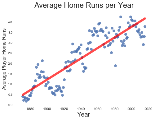
(Home runs have increased since 1880)
While the trend appears solidly linear, closer inspection reveals that average home runs have snaked up and down for over a century. This snaking motion suggests different periods within the larger trend. For example, there is a pronounced dip in home run production at the beginning of the 20th century, lending credence to the Deadball Era label.
(Though home runs have increased linearly since 1880, closer inspection reveals several peaks and valleys over time, suggesting different periods of home run production)
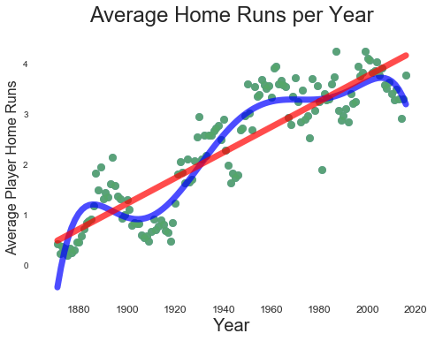
In fact, there may very well be several periods of home run production. There is a parabolic rise and fall in home run production beginning in the 1980s and ending around 2014, strongly suggesting a beginning and end to a steroid era. The question is, how can we tease periods, if any, out of historical home run production? Eyeballing data is more art than science. Setting blocks of time based on decades is too arbitrary and based on little other than the convenience of grouping by blocks of ten. This is where machine learning can add more science to what is arbitrary and artful.
K-MEANS CLUSTERING TO THE RESCUE
K-means clustering is a machine learning method that groups data into clusters. The algorithm calculates the mean distance of data points from a predetermined number of clusters, and assigns each data point to the nearest centroid of each cluster. In plain English, K-means finds the nearest home for a data point based on its distance from that home. These homes are clusters. (If you are interested in a more detailed description, click here, here and here).
The real trick to K-means clustering is determining how many homes or clusters to build for the data points. One can eyeball a dataset and look for an “elbow” in the data where the variance in the data decreases. A better method is to calculate a silhouette score, sometimes called the silhouette coefficient. A silhouette score tells a researcher how well a point lies in its cluster:
The Silhouette Coefficient is calculated using the mean intra-cluster distance (a) and the mean nearest-cluster distance (b) for each sample. The Silhouette Coefficient for a sample is (b - a) / max(a, b). To clarify, b is the distance between a sample and the nearest cluster that the sample is not a part of.” (See Scikit-learn documentation here)
Ultimately, the above silhouette calculation produces a score between -1 and 1, with 1. The lower the score, the more likely it is that data has been assigned to the wrong clusters
CLUSTERING HOME RUNS
Let’s apply clustering to average player home runs. For the sake of simplicity, we will run models with two to 10 clusters. We will refer to our cluster numbers as ‘k’.
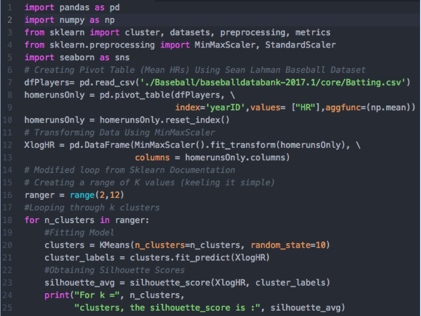
(Code modified from a loop available in the scikit-learn documentation. It loops through several models, adding different values for k. The code then prints the silhouette scores for each model.)
After running our code, we get 12 different silhouette scores ranging from 0.62 (two clusters) to 0.45 (five clusters). We also see that three clusters (0.54) and ten clusters (0.51) perform better than most other models.
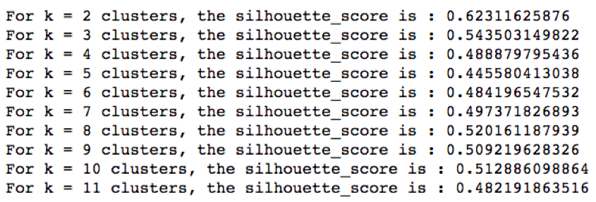
(Silhouette scores for home run K-means clustering models. The model with the highest silhouette score has two clusters.)
Let’s visualize the model with two clusters. The clusters are of similar size, and though they do not produce a perfect silhouette score, they produce the best silhouette score for our data set.
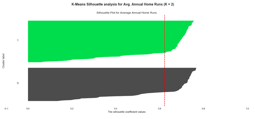 (Visualization of two home run clusters using code modified from the scikit-learn documentation. The clusters are of similar size, though slightly different. These are the best clusters for our home run data set.)
If we again visualize our annual home run plot, coloring each data point by its respective cluster, we find two distinct home run periods. Though the clusters do not begin and end at neatly at one specific year, the transition from cluster zero to cluster one begins in 1938 and ends in 1956.
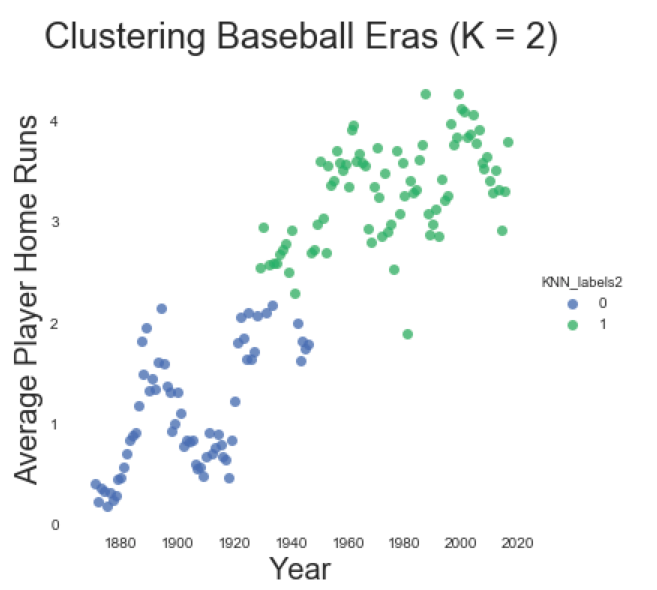 (Visualizing home runs by year. Each data point is colored by its respective cluster assignment. With k=2 clusters, we see two distinct home run periods, with a long transition period beginning in 1938 and ending in 1956.)
Given the long transition period in our two cluster model, we should consider whether three clusters are more appropriate, even though it has a lower silhouette score. This results in a period that roughly corresponds with The Deadball Era (1880-1920); a transition period (1921-1952); and a Modern Era (1953-2016). Not bad.
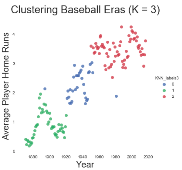 (Visualizing home runs by year, with each data point assigned by cluster. While a k=3 cluster model comforms with traditional baseball periods, this model has a lower silhouette score than the two cluster model.)
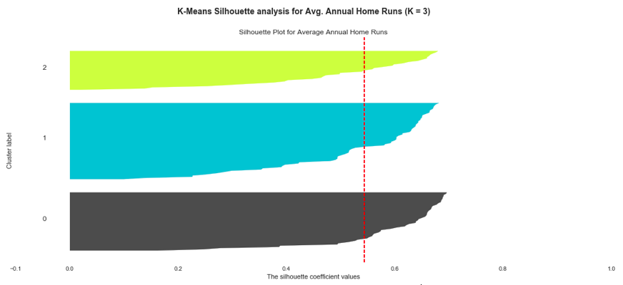 (The K-means average home run model (k=3) produces uneven clusters and a lower silhouette score when compared with a model utilizing two clusters)
ANALYZING HOME RUN CLUSTERS
This clustering exercise shows that K-means can provide researchers with a scientific method of period analysis. If we want to compare statistics from the olden days with modern statistics, there is no need to base our analysis on an arbitrary starting point such as decades, centuries and seasons; K-means defines the parameters for us.
For example, let’s compare the two clusters from our best model (k=2). Though the clusters overlap in terms of time, we have complete separation at 1956. “Cluster 1” begins after 1956 and has higher average home runs per player (3.47 home runs). Cluster 1 also has higher variability among players in terms of home runs, with a standard deviation of 7.13 home runs. In contrast, “Cluster 0” has fewer average home runs at 1.70 per player, in addition to a lower standard deviation of 4.35 home runs.
If we examine this model further, we see that the single season home run leader in Cluster 1 is Barry Bonds with 73 home runs achieved in 2001. With 60 home runs, Babe Ruth is the single season home run leader in Cluster 0. With this in mind, I am dubbing Cluster 0 as the Babe Ruth Home Run Era, and Cluster 1 as the Barry Bonds Home Run Era
If we plot histograms for the two periods in terms of average home runs, we see the clear emergence of the Babe Ruth and Barry Bonds Eras, notwithstanding the expected overlap in time. After 1955, there are more home runs on average when compared to the era before 1955. In short, we have a less arbitrary basis to conduct historical analysis.
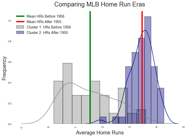 (Histograms show the home run distributions for two clusters produced by our best K-means Home Run model (K=2). The red and blue lines show the actual averages for both eras, and not an average of averages)
Interestingly, the Babe Ruth Era is right skewed. The Barry Bonds Era appears Gaussian. I have not discerned the implications of this, though this might be expected given the increased specialization of baseball, in addition to the prevalence of sluggers on every team. In the Babe Ruth Era, a monster home run hitter is akin to a millionaire, rare and at the right side of the distribution.
RISKS
Of course, there are risks to performing historical analysis using clustering.
The first risk is the process of clustering averages over time, as we did above. Our home run example is essentially a time series. There are some who argue that the clustering of a time series is meaningless as the clusters converge on a local, not a global optimum. There are others who are comfortable clustering time series. As one scholar noted, the appropriateness of clustering depends on the usefulness of clustering for achieving our final goal.
In our case, clustering is very useful. We are not attempting to recognize patterns so as to make future predictions as much as we are attempting to group like years together so as to find enough similarity to create definitional periods.
A other risk is that additional data could render our clusters somewhat meaningless. For instance, we cannot analyze doubles within the parameters of our home run analysis, as doubles cluster differently than home runs. More problematic, no clustering analysis of doubles has a silhouette score over 0.50, making our clusters less useful than our home run model. Making matters even more difficult, there are two clusters for doubles that intersperse years 1880-1949. Though the cluster after 1950 is chronological, it’s still not a neat picture.
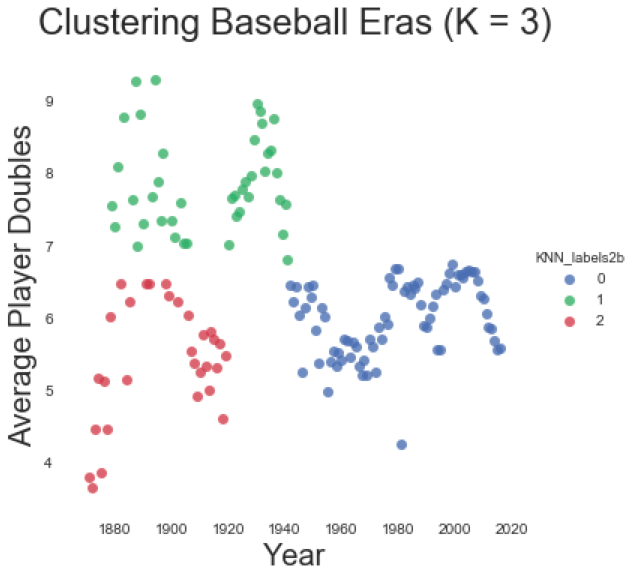 (Clustering doubles over time. A clustering for doubles creates different periods than the clusters for average home runs. It’s messy.)
There are two remedies for the above clustering risks: First, researchers must be very clear about that which they are clustering. If clustering home runs, keep the analysis to home runs. Second, understand that history can be messy, and clusters might not emerge chronologically. This does not mean that we cannot extract meaning from our cluster. As we see from the visualization below, there was period before 1950, where doubles periodically spiked and dipped. This is the nature of baseball before the modern era.
A final risk of the above models is the use of average home runs. K-means finds the mean distance from clusters. If we cluster the home run production of every player, we will find similar, but different clusters with different chronologies. Again, this risk is best remedied by being especially clear about that which one is researching. In this blog post, we used average home run production for convenience sake more than anything else.
Conclusion
Clustering does offer historical researchers a means towards creating historical periods using machine learning. While it is not always a neat process, neither is history, as history has its transition periods. Clustering is still better than arbitrarily picking and choosing the beginning and ends of one’s research parameters.